
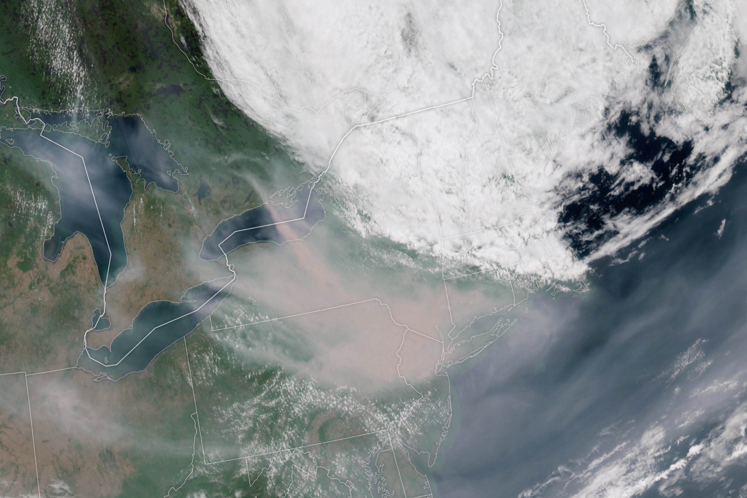
When ten wildfires burned simultaneously across the western United States in August 2021, the fires themselves scorched roughly 2 million acres. But the smoke they produced blanketed 7.5 million square kilometers — an area larger than the continental United States — pushing air quality to hazardous levels for communities more than 2,000 miles from the nearest flame. As another wildfire season approaches, DisasterAWARE's multi-source smoke intelligence capability fuses satellite imagery, high-resolution atmospheric modeling, and hundreds of ground-truth air quality sensors into a single, continuously updated picture of smoke hazards — delivered through our platform and APIs.
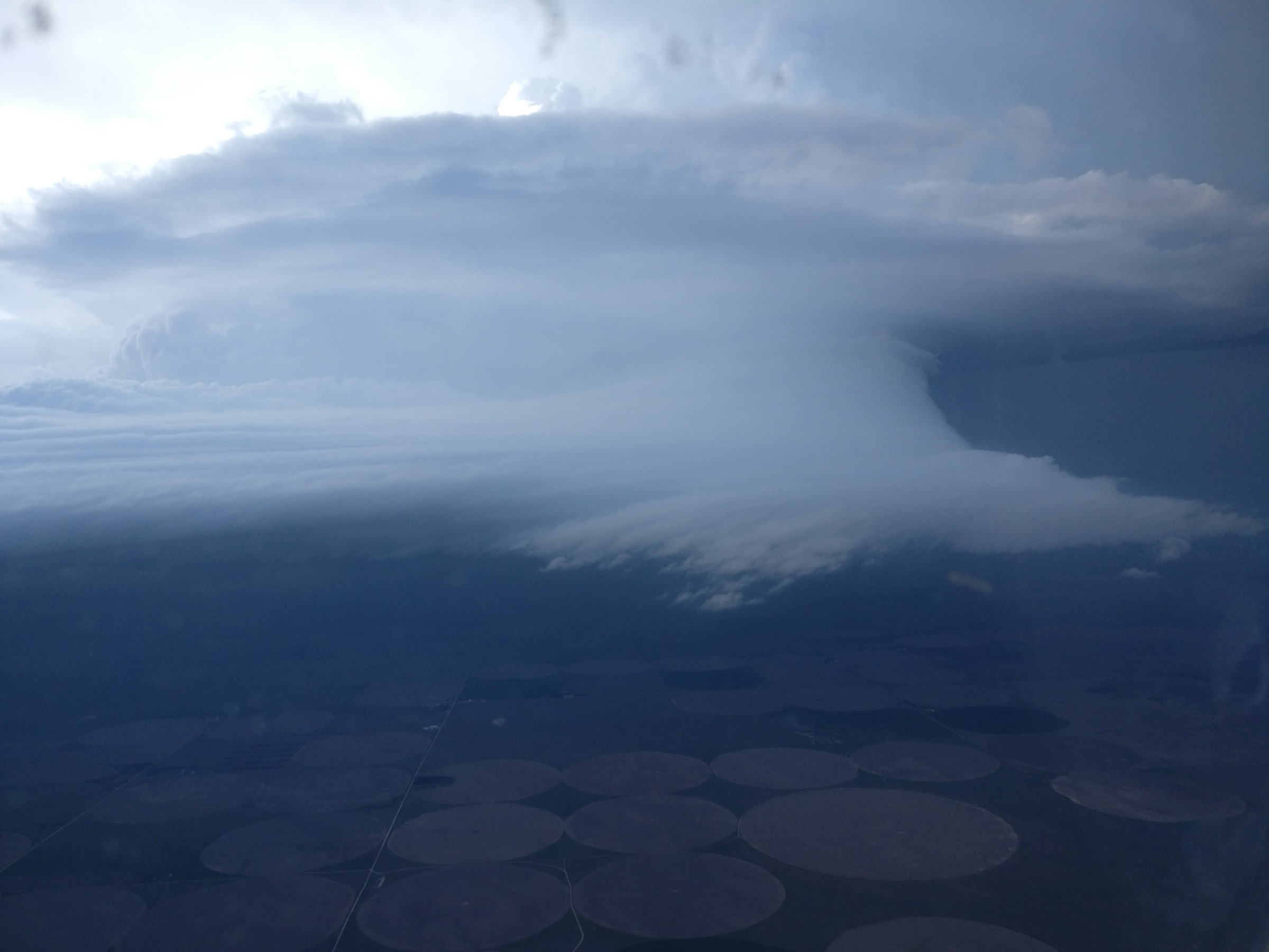
Wildfires dominate headlines with dramatic images of flames, evacuations, and charred landscapes. But for every acre that burns, smoke can degrade air quality across entire states — and across entire continents. During major wildfire events, smoke routinely crosses national borders, infiltrates cities hundreds of miles downwind, and persists for weeks as atmospheric conditions trap particulate matter at ground level.
The health impact is staggering — and the difference between PM2.5 concentrations isn't academic. It's the difference between an inconvenience and a medical emergency:
| PM2.5 (µg/m³) | AQI | Category | Health Impact |
|---|---|---|---|
| 0–12.0 | 0–50 | Good | Minimal risk for the general population |
| 12.1–35.4 | 51–100 | Moderate | Unusually sensitive individuals may experience respiratory symptoms |
| 35.5–55.4 | 101–150 | USG | Children, older adults, and those with heart or lung disease experience effects; increased asthma attacks |
| 55.5–150.4 | 151–200 | Unhealthy | General population begins to experience effects; significant aggravation for sensitive groups |
| 150.5–250.4 | 201–300 | Very Unhealthy | Health alert — serious effects for entire population; cardiovascular and respiratory hospitalizations increase |
| 250.5+ | 301–500 | Hazardous | Health emergency — everyone at risk; 2–3x increase in ER visits; premature death risk for elderly and those with pre-existing conditions |
Fine particulate matter (PM2.5) from wildfire smoke is especially dangerous because of its composition. Unlike industrial pollution, wildfire smoke contains a complex mix of organic carbon compounds, polycyclic aromatic hydrocarbons, and volatile organic compounds that penetrate deep into the lungs, cross into the bloodstream, and trigger systemic inflammatory responses. Research has shown wildfire-specific PM2.5 is up to ten times more harmful to respiratory health than equivalent concentrations from other sources.
The populations most at risk — children under 14, adults over 65, pregnant women, and anyone with asthma, COPD, or cardiovascular disease — are also the least able to simply "stay inside and wait it out." Studies following the 2020 and 2021 western wildfire seasons found that prolonged smoke exposure (more than 3 consecutive days at Unhealthy or above) was associated with a 15–20% increase in emergency department visits for respiratory distress and a measurable increase in cardiac events, even in populations with no prior history.
During the 2021 western wildfire season, emergency room visits for respiratory complaints surged across states that hadn't seen a single flame — from the Dakotas to Minnesota, from Colorado to the Gulf Coast. The people affected weren't near a wildfire. They were breathing one.
Yet most hazard monitoring systems treat smoke as an afterthought: a satellite-observed plume with a rough density estimate, disconnected from the fires producing it and from the ground-level air quality data that tells you what people are actually breathing.
That gap is exactly what DisasterAWARE's smoke intelligence capability is designed to close.
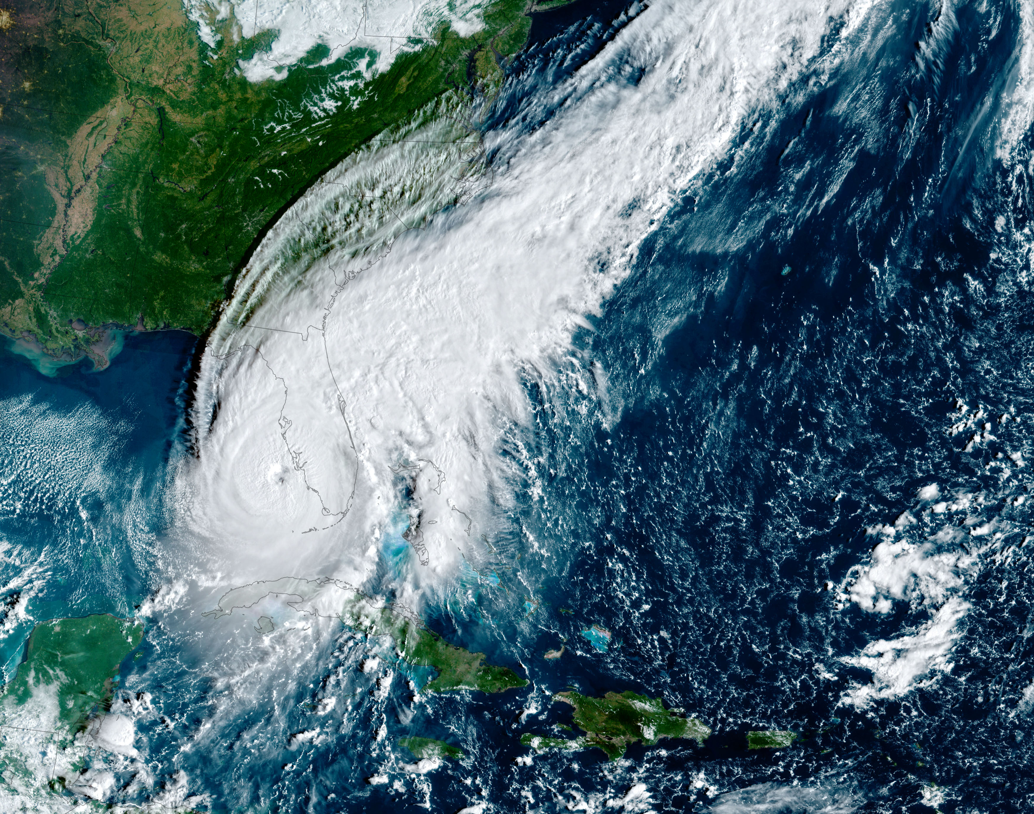
The map below reconstructs August 30, 2021 — one of the worst smoke days in recent U.S. history. Ten major wildfires, led by California's Dixie Fire (963,000 acres), produced a smoke plume that stretched from the Pacific coast to the Great Lakes and from British Columbia to the Gulf of Mexico. Toggle the layers to explore smoke density zones, sensor impact areas, air quality station readings, and NIFC fire boundaries. Click any feature for detailed data.
Data sources: NOAA Hazard Mapping System (HMS), EPA AirNow, NIFC fire perimeters. Visualization powered by DisasterAWARE smoke intelligence.
Traditional smoke monitoring gives you a satellite image and a rough classification — light, medium, or heavy. That's a starting point, but it doesn't answer the questions that matter: How bad is the air quality on the ground? Where are conditions actually dangerous? Are things getting worse or better?
DisasterAWARE's smoke intelligence layer answers those questions by fusing multiple data sources into a single coherent picture:
NOAA's Hazard Mapping System (HMS) provides analyst-drawn smoke polygons based on multi-spectral satellite imagery. These polygons establish the observable footprint of smoke — where it is, and at what density (light, medium, or heavy). On August 30, 2021, HMS analysts drew 102 smoke polygons for the main western smoke event alone.
But satellite observations have a fundamental limitation: they show you what's in the atmosphere, not what's reaching the ground. A thick plume at 15,000 feet produces a dramatic satellite signature but may cause minimal ground-level impact, while a thinner layer trapped by a temperature inversion can push PM2.5 readings into hazardous territory.
This is where sensor data transforms observation into intelligence. DisasterAWARE ingests readings from EPA's AirNow network and correlates them against the satellite-observed smoke extents. On the day shown in the map, 298 AirNow monitoring stations fell within the smoke footprint, with 20 additional stations nearby providing edge-of-plume context.
Look closely at the map and you'll notice something important: the air quality sensors around the outer edges of the smoke polygons are consistent with the satellite-based density classification — confirming the plume boundary. But within the plume, individual sensors frequently read higher than the surrounding area, revealing localized pockets where terrain, wind, or atmospheric conditions are concentrating particulate matter. This ground-truth detail is critical for understanding actual exposure — a broad "unhealthy" classification doesn't capture the difference between a reading of 60 µg/m³ and one of 427 µg/m³.
One of the most powerful features of the fusion algorithm is sensor-primary severity correction. On August 30, the atmospheric model classified much of the western smoke plume as "Unhealthy" — a serious but manageable air quality category. But 66 AirNow monitors within the plume were reading PM2.5 concentrations of 427 µg/m³, corresponding to an AQI of 500: the maximum possible score, rated Hazardous.
The system automatically elevated the event severity based on the ground-truth sensor data, overriding the model's lower estimate. The final severity classification reflects the worst of either the model's assessment or the peak sensor reading — because when a sensor is telling you the air is dangerous, that's not a data point to be averaged away.
Each sensor with elevated readings generates a local impact zone — a buffer that extends the sensor's warning to surrounding areas. But these buffers are intelligently constrained: they're capped by the distance to the nearest clean sensor, preventing false bridging across areas where readings have returned to normal. On August 30, 67 elevated sensors generated individual impact zones within the smoke plume, creating a mosaic of confirmed ground-level hazard areas.
This approach delivers something that neither satellite imagery nor atmospheric models can provide on their own: validated, localized severity information that distinguishes genuinely dangerous air from areas where the plume is present but ground-level impact is modest.
The interactive map captures four distinct smoke events on a single day. The dominant event tells a story of continental-scale impact:
The plume stretched from the California-Oregon fire complex eastward across the Great Basin, the Rockies, the Northern Plains, and into the Great Lakes states — affecting communities in more than 20 states and multiple Canadian provinces. Meanwhile, a separate smoke event drifted south over the Gulf of Mexico, and smaller events impacted the Carolinas and the mid-Atlantic.
Producing accurate, actionable smoke intelligence from raw data is a harder problem than it appears. Satellite imagery tells you where smoke is in the atmosphere but not how it's affecting the ground. Atmospheric models predict PM2.5 concentrations but carry inherent biases that can understate — or overstate — actual conditions by an order of magnitude. Individual sensor readings are precise but sparse, covering a tiny fraction of the affected area. Each source, on its own, gives an incomplete and sometimes misleading picture.
DisasterAWARE's approach is to treat these as complementary signals and fuse them through a rigorous, multi-step analytical pipeline — each stage correcting and refining the output of the stage before it:
1. High-resolution atmospheric modeling — The pipeline begins with NOAA's HRRR-Smoke model, which generates a 3-kilometer-resolution PM2.5 concentration field across the entire domain. This isn't a coarse national average — it's a grid of hundreds of thousands of cells, each with its own modeled particulate concentration based on fire emissions, wind patterns, atmospheric mixing heights, and terrain. This establishes the physics-based foundation that sensor data will refine.
2. Statistical bias correction against ground truth — Every AirNow and PurpleAir station within and near the smoke footprint becomes a correction point. The system computes the residual — the difference between what the model predicted and what the sensor actually measured — at each station. These residuals are then interpolated across the entire grid using radial basis function (thin-plate spline) interpolation, a mathematical technique that produces a smooth correction surface. The effect is powerful: the model is systematically pulled toward reality at every point where a sensor exists, and the correction bleeds intelligently into the gaps between sensors based on spatial proximity. On a day like August 30, 2021, this stage incorporates readings from over 300 sensors, each one nudging the model toward ground truth.
3. Satellite-constrained masking — The bias-corrected surface is then masked against NOAA HMS satellite observations. Outside areas where analysts have confirmed visible smoke from space, the fused PM2.5 values are attenuated by 70% — a deliberate analytical decision that prevents the model from projecting smoke into areas where satellites see clear skies. This step resolves a common failure mode in model-only systems: false positives that trigger unnecessary alerts in unaffected areas.
4. AQI-standard contouring — The corrected, masked surface is contoured at the EPA's standard AQI breakpoints, generating nested polygons that map directly to the air quality categories used by public health agencies, OSHA, and emergency managers worldwide. This isn't a proprietary scoring system — it's the same framework that drives school outdoor-activity decisions, construction site work-stop orders, and airline operational assessments. The output is immediately actionable because it speaks the language decision-makers already use.
5. Sensor-primary severity override — Here's where the system makes a critical analytical judgment: the final severity for each smoke event is set to the maximum of the model-derived polygon category and the peak sensor reading within it. If the fused model says "Unhealthy" but a cluster of sensors is reading "Hazardous," the event is classified Hazardous. This is a deliberate design choice — models are useful for coverage, but when a calibrated sensor 20 feet above ground level is measuring 427 µg/m³, that measurement supersedes any model's prediction. On August 30, 2021, this override elevated the main smoke event by two full AQI categories.
6. Spatially-constrained sensor impact zones — Each elevated sensor generates a local hazard buffer extending its warning to the surrounding area. But unlike a naive radius-based approach, these buffers are dynamically constrained: each one is capped by the distance to the nearest sensor showing clean or lower readings. This prevents a single hot sensor from falsely implying hazardous conditions across a 50-mile radius when a sensor 10 miles away shows clean air. The result is a precision mosaic — 67 individual impact zones on August 30 — that reflects the complex, patchy reality of ground-level smoke rather than imposing artificial uniformity.
7. Observational floor — Finally, any HMS-observed smoke plume that isn't already represented by a fused event is retained as an informational hazard. This ensures that the system never drops smoke that's visible from space simply because the fusion pipeline assigned it below a threshold. No data is silently discarded.
The cumulative effect of these seven stages is a product that is substantially more accurate and useful than any of its inputs alone. Every layer of analysis adds information and removes noise. The result tells you not just where smoke is, but how bad it is on the ground, which communities are most affected, and how confident the assessment is — updated continuously as new sensor data, satellite passes, and model runs arrive.
Wildfire smoke is not a western U.S. problem anymore. Over the past decade, smoke events have disrupted daily life in cities as far removed from fire as New York, Chicago, and Washington, D.C. The 2023 Canadian wildfire season turned skies orange over the Eastern Seaboard. The 2025 season saw smoke-driven AQI warnings across the Midwest for three consecutive weeks.
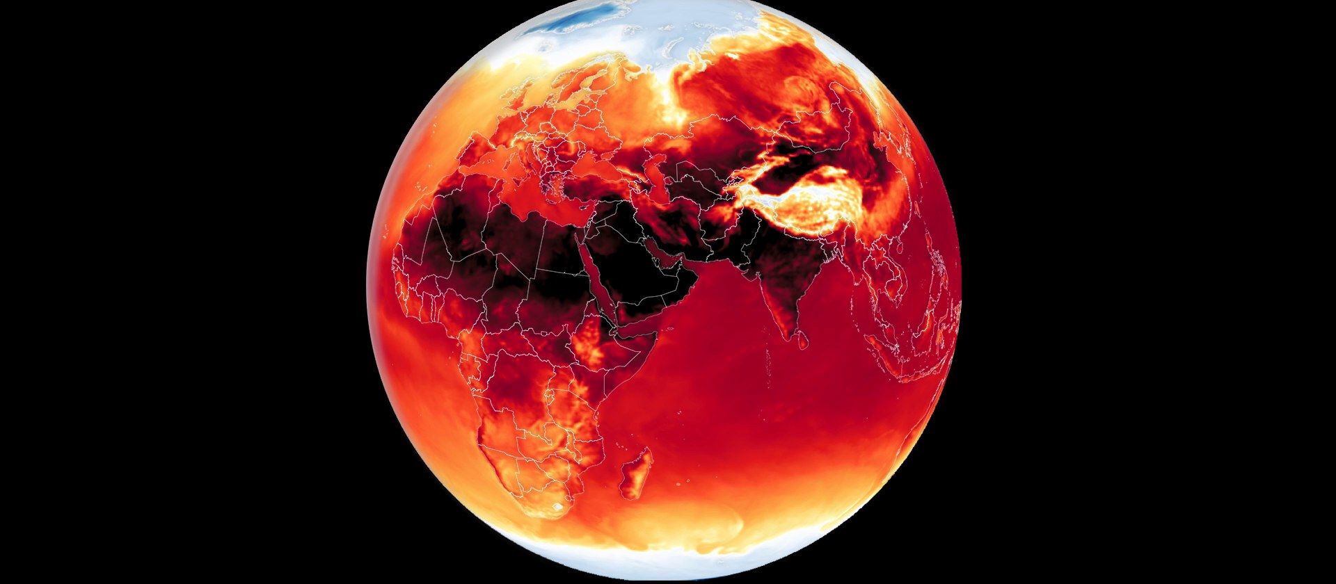
As climate conditions continue to extend fire seasons and increase fire intensity, smoke will affect more people, more often, in places that have historically considered wildfire a distant concern.
For enterprise risk managers, supply chain operators, travel and logistics planners, and public safety officials, smoke creates cascading impacts that extend far beyond air quality:
DisasterAWARE's smoke intelligence gives organizations the ability to see these impacts coming — not as a vague "smoke in the area" advisory, but as precise, sensor-validated, continuously updated intelligence that supports real operational decisions.
DisasterAWARE's smoke intelligence is delivered through the DisasterAWARE Enterprise platform and APIs, enabling organizations to integrate smoke hazard data directly into their own systems, dashboards, and automated workflows.
Every smoke event includes:
The data is structured, machine-readable, and updated continuously — designed for both human analysts monitoring situations in real time and automated systems that need to trigger alerts, reroute operations, or notify stakeholders when conditions cross critical thresholds.
With wildfire season approaching, ensure your organization has the intelligence it needs to understand smoke hazards before they arrive — not after. Contact us to learn how DisasterAWARE's smoke intelligence can support your operations, or start a free trial to explore the platform.
Data sources: NOAA Hazard Mapping System (HMS), EPA AirNow, NOAA HRRR-Smoke model, National Interagency Fire Center (NIFC). Map and analysis powered by DisasterAWARE. Banner image: NASA Earth Observatory / NOAA GOES-18 satellite, June 7, 2023.


-min.png)


.png)


.png)


Decision-ready intelligence for understanding what's happening, what is impacted, and what to do next. Global hazard, severe weather, catastrophe, and physical risk intelligence trusted by governments, enterprises, insurers, humanitarian organizations, and technology platforms worldwide.
Request DemoContact Us